Heat map
From Wikipedia, the free encyclopedia

Heat map generated from DNA microarray data reflecting gene expression values in several conditions
Heat maps originated in 2D displays of the values in a data matrix. Larger values were represented by small dark gray or black squares (pixels) and smaller values by lighter squares. Sneath (1957) displayed the results of a cluster analysis by permuting the rows and the columns of a matrix to place similar values near each other according to the clustering. Jacques Bertin used a similar representation to display data that conformed to a Guttman scale. The idea for joining cluster trees to the rows and columns of the data matrix originated with Robert Ling in 1973. Ling used overstruck printer characters to represent different shades of gray, one character-width per pixel. Leland Wilkinson developed the first computer program in 1994 (SYSTAT) to produce cluster heat maps with high-resolution color graphics. The Eisen et al. display shown in the figure is a replication of the earlier SYSTAT design.
There are different kinds of heat maps:
- Web heat maps have been used for displaying areas of a Web page most frequently scanned by visitors. Web heatmaps are often used alongside other forms of web analytics and session replay tools.
- Biology heat maps are typically used in molecular biology to represent the level of expression of many genes across a number of comparable samples (e.g. cells in different states, samples from different patients) as they are obtained from DNA microarrays.
- The tree map is a 2D hierarchical partitioning of data that visually resembles a heat map.
- A mosaic plot is a tiled heat map for representing a two-way or higher-way table of data. As with treemaps, the rectangular regions in a mosaic plot are hierarchically organized. The means that the regions are rectangles instead of squares. Friendly (1994) surveys the history and usage of this graph.
- The colors lack the natural perceptual ordering found in grayscale or blackbody spectrum colormaps.
- Common colormaps (like the "jet" colormap used as the default in many visualization software packages) have uncontrolled changes in luminance that prevent meaningful conversion to grayscale for display or printing. This also distracts from the actual data, arbitrarily making yellow and cyan regions appear more prominent than the regions of the data that are actually most important.
- The changes between colors also lead to perception of gradients that aren't actually present, making actual gradients less prominent, meaning that rainbow colormaps can actually obscure detail in many cases rather than enhancing it.
Software implementations

A sample heat map created using a Surface Chart in Microsoft Excel.
- PermutMatrix is a work space designed to graphically explore numerical datasets. It offers several methods for the optimal reorganization of rows and columns of a numerical dataset.[6]
- NeoVision Hypersystems, Inc., a software firm founded by Cormac Kinney, and funded by Intel and Deutsche Bank, developed Heatmaps depicting real time financial data and calculations, which were licensed to over 50,000 users. NeoVision Heatmaps became a feature on nasdaq.com.[7]
- R Statistics, a free software environment for statistical computing and graphics, contains several functions to trace heat maps [1]
- Gnuplot, a universal and free command-line plotting program, can trace 2D and 3D heat maps [2]
- The Google Docs spreadsheet application includes a Heat Map gadget, but for country-wise data only, not for general matrix data.
- Dave Green's 'cubehelix' colour scheme provides resources for a colour scheme that prints as a monotonically increasing greyscale on black and white postscript devices [3].
- Qlucore includes a heat map that is dynamically updated when filter parameters are changed.
- The ESPN Gamecast for soccer games uses heat maps to show where certain players have spent time on the field.
- By searching the List of bioinformatics companies more tools for heat maps can be found.
- Microsoft Excel can be used to generate heat maps using the Surface Chart. Though the default color range for Surface Charts in Excel is not conducive to heat maps, the colors can be edited to generate user-friendly and intuitive heat maps.
- Sightsmap is a sightseeing popularity heatmap overlaid on Google Maps, based on crowdsourcing: the number of Panoramio photos taken at each place in the world.
- Maptitude is business mapping software that includes a variety of customizable heat mapping tools and can use external data such as Excel files to show the results on geographic maps of your location.
Examples
-
 Geographical heat map of ocean salinity, using a rainbow colormap
-
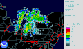 Lake effect snow - weather radar information is usually shown using a heatmap.
-
 Choropleth heatmap showing election results by municipality
-
 Human voice visualized with a spectrogram; a heat map representing the magnitude of the STFT. An alternative visualization is the waterfall plot.
-
 Example showing the relationships between a heat map, surface plot, and contour lines of the same data
-
 Combination of surface plot and heatmap, where the surface height represents the amplitude of the function, and the color represents the phase angle.


References
- "United States Patent and Trademark Office, registration #75263259". 1993-09-01.
- Borland, D., & Taylor, M. R. (2007). Rainbow Color Map (Still) Considered Harmful. IEEE Computer Graphics and Applications, 27(2), 14-17. IEEE Computer Society. Retrieved from http://www.ncbi.nlm.nih.gov/pubmed/17388198
- How NOT to Lie with Visualization - Bernice E. Rogowitz and Lloyd A. Treinish - IBM Thomas J. Watson Research Center, Yorktown Heights, NY
- Mark Harrower1and Cynthia A. Brewer - ColorBrewer.org: An Online Tool for Selecting Colour Schemes for Maps, The Cartographic Journal Vol. 40 No. 1 pp. 27–37 June 2003
- Green, D. A., 2011, `A colour scheme for the display of astronomical intensity images', Bulletin of the Astronomical Society of India, 39, 289. Dave Green's `cubehelix' colour scheme
- Caraux, Gilles; Pinloche S. (2005). "PermutMatrix: a graphical environment to arrange gene expression profiles in optimal linear order". Bioinformatics. 7 21: 1280-1281. doi:10.1093/bioinformatics/bti141.
- Sansoni, Silvia (1999-05-17). "Forbes Magazine Article on NeoVision Heatmaps".
- Bertin, J. (1967). Sémiologie Graphique. Les diagrammes, les réseaux, les cartes. Gauthier-Villars.
- Eisen, M.B., Spellman, P.T., Brown, P.O. & Botstein, D. (1998). "Cluster analysis and display of genome-wide expression patterns". Proc. Natl. Acad. Sci. USA 95 (25): 14863–14868. doi:10.1073/pnas.95.25.14863. PMC 24541. PMID 9843981.
- Friendly, M. (1994). "Mosaic displays for multi-way contingency tables". Journal of the American Statistical Association (American Statistical Association) 89 (425): 190–200. doi:10.2307/2291215. JSTOR 2291215.
- Ling, R.F. (1973). "A computer generated aid for cluster analysis". Communications of the ACM 16 (6): 355–361. doi:10.1145/362248.362263.
- Sneath, P.H.A. (1957). "The application of computers to taxonomy". Journal of General Microbiology 17 (1): 201–226. doi:10.1099/00221287-17-1-201. PMID 13475686.
- Wilkinson, L. (1994). Advanced Applications: Systat for DOS Version 6. SYSTAT Inc. ISBN 978-0-13-447285-0.
External links
- The History of the Cluster Heat Map. Leland Wilkinson and Michael Friendly.
No comments:
Post a Comment