Creating well-formatted timeline cards
Timeline cards are the core of your user's interaction with Glass. They not only display your content but are also how your users interact with content on Glass. It is important to create timeline cards that are clear, presentable and readable in both format and style.The Mirror API provides three ways to design cards: by providing text, by using our HTML templates, and by creating your own HTML template.
Using text
Providing text is the easiest way to create beautiful, legible cards on Glass. You simply provides the API the content that you'd like to display in the form of text and optional images, and Glass makes sure it looks great. Your Glassware can specify text cards by populating thetext field
on timeline items.
Use text when:
- The content you would like to display consists mainly of text.
- You want Glass to decide how to best present the content to your user. As our interface evolves, presentation of your content will evolve with it.
- You would like your content to remain up-to-date and consistent with the overall Glass experience.
Using Glass HTML templates
Not all content can be expressed in a few lines of text. Sometimes you need to send structured content to a user's timeline, or you need control over formatting. To accommodate this, the Mirror API provides anhtml field on
timeline items that accepts HTML markup.To save your development time and to ensure a consistent experience for your users, we have created a set of HTML templates that address content that is commonly displayed on Glass. We strongly recommend that you use the templates as a guide for building out your HTML cards. You can find a complete inventory of these templates on the Mirror API Playground.

Use the provided HTML templates when:
- You want to display structured content such as lists or tables.
- You want greater flexibility in designing your content.
Displaying your own custom HTML
Sometimes, you need to send content to Glass that falls outside of the cases handled by our templates. In these situations, you can design your own HTML template and supply it to thehtml field
of timeline items.Crafting your own template gives you the power to control how your content is rendered, but with that power comes responsibility. It's important to keep content on Glass consistent and prevent unexpected surprises. You can create your own custom HTML to display content, but we strongly encourage you to use our HTML templates, because they demonstrate our best practices. If you must develop a new template, follow these guidelines.
- Use the styles found in base_style.css. This file is included in all timeline cards rendered on Glass.
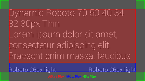
- Follow the same rules for gutters and spacing as the built-in templates as illustrated in these diagrams.


Delivering photos and video
You can attach photos or videos to your timeline cards. Photos appear full-screen behind any text associated with the timeline card. Videos behave similarly, but the text disappears when the video plays.
To ensure the optimal experience:
- Send full screen images and video at a 16x9 aspect ratio.
- Target a 640x360 pixel resolution.
- Always specify both the height and width of an image. This prevents positioning reflows around an image as cards render. It also allows Glass to display a well-formatted error message if the image is not available.
- Keep the duration of video clips between 10 and 20 seconds. Glass is a device designed for quick data consumption, so long videos are usually not appropriate for users to consume.
Bundling timeline cards
Bundles allow you to create paginated content to display more content, save space on a user’s timeline, and to group like information together. Bundles have a page curl at the top right corner of the timeline card that offers users a visual cue that more information is available.
Bundling is a simple concept but can be used incorrectly. Rather than providing a set of rules for when to bundle or when not to bundle, here is a list of common bundling use cases alongside common misuses.
Cases where bundles work well:
- A thread of emails or short messages
- Several pages of a long article
- Related articles inserted all at once
- A list of key events and score updates for an ongoing sports game
- All content from your service
- Many headlines sent to Glass over the course of a day
Creating menu items
Menu items allow your user to interact directly with the timeline card that you have inserted into their timeline. The API exposes powerful built-in menu items and allows you to create your own custom menu items.

Follow these guidelines when designing your menus:
- If you specify an icon, use a 50x50 pixel image.
- Limit display names to a few words if possible.
- Use the default icon and display name for built-in menu items unless you are using the menu item for something very different.
REPLY, REPLY_ALL - Voice replies are intended to capture free form input by voice. Do not use voice replies to capture a limited set of options, such as possible moves in a game.
Offering menu items to remove content from a user's timeline
There are two general ways to allow users to remove content from their timelines, dismissing and deleting:A "Dismiss" menu item should remove the timeline card from the timeline. In general, timeline cards are self-dismissing in that they naturally get pushed back in time as new cards appear, so you normally should not offer this feature. You should always aim to make the user experience as simple as possible, so making a "Dismiss" feature central to your Glassware's experience requires users to actively manage your app, which is undesirable.
A "Delete" menu item dismisses the timeline card and deletes the content that corresponds to the timeline card everywhere it is stored (local and server storage). Do not confuse your users by offering a "Delete" menu item if the functionality you offer is a "dismiss".
Sharing content to contacts
Contacts represent a person or abstract entity to which your user can share content. Follow these rules to provide the best experience to your user:- Contacts appear in full screen, so use a 640 x 360 pixel icon.
- Specify
acceptTypesto make sure your contact can do something useful with any content that your user shares.
Delivering timeline cards appropriately
Beautiful cards are only half of the equation. To provide a great experience, they also have to be delivered at the right time and in the right volume.- Deliver a "Welcome" card to the Glass device after a user authorizes your Glassware. This lets your users know that setup was successful.
- Deliver content as it happens, especially if you're triggering an audio notification.
- Sometimes it's advantageous to deliver content in digest form. If you're sending a digest, it's best to send it silently.
Quick Reference
Here is a brief list of the specs to guide your development:- Screen aspect ratio
- 16x9
- Screen resolution
- 640 x 360 pixels
- Share contact icon size
- 640 x 360 pixels
- Menu option icon size
- 50 x 50 pixels
- Supported media format
- Container: MP4
- Video: H.264 baseline and H.263 baseline
- Audio: AAC and MP3
No comments:
Post a Comment